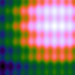
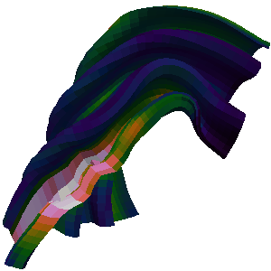
This page provides advice for using colors in scientific visualization. More specifically, this page provides color maps that you can use while using pseudocoloring of a scalar field. The color maps are organized by how and where they are best used. Each color map shows some example usage and provides color tables in CSV format so that they can readily be used in rendering system textures or entered into visualization software. For simplicity, the color tables are provided in many different lengths and with colors expressed in both bytes (integers between 0 and 255) and floats (decimals between 0.0 and 1.0). Each color map also has instructions on getting these colors in the ParaView visualization application. Where applicable, Jupyter Python notebooks containing details about how each color map is generated. You can either run the code directly with the appropriate software or copy/paste scripts into your own interpreter. Each color map below is demonstrated on a 2D heat map and 3D surface. The data for both can be downloaded here.
This work originates from the paper “Why We Use Bad Color Maps and What You Can Do About It.” Details about this paper are given below. Another related publication is “Diverging Color Maps for Scientific Visualization,” which describes specifics about one particular type of color map. Details of this paper and the techniques used can be found on its companion page.
Below is a collection of color maps that you can use to apply in scientific visualization.
A note about license. All original color maps on this page are released as public domain (CC0). I waive all copyrights and related rights so that these color maps may be used freely. However, please note that much of this work is borrowed or derivative. I have avoided works where someone has exercised private intellectual property rights and kept to open work, but some of these color maps might be covered under other licensing agreements. I make my best effort to identify the source of any borrowed or derivative work and the respective license.
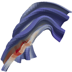
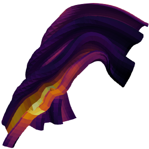
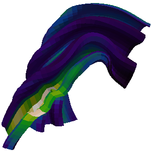
3D Surface Color Maps
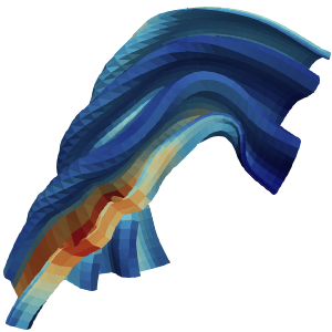
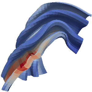
In general a color map should use changes in luminance (brightness) to communicate changes in value. However, in a 3D scene, shading cues, which are themselves changes in brightness, are vital to understanding shapes. Thus, you have to avoid having the brightness changes in the color map interfere with the brightness changes in shading and vice versa. You achieve this by limiting the color map to reasonably bright colors. Because this reduces the total range of brightness in the color map, I find it most effective to use a diverging (double-ended) color map.
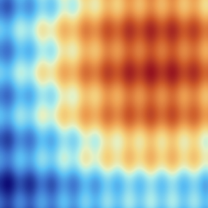
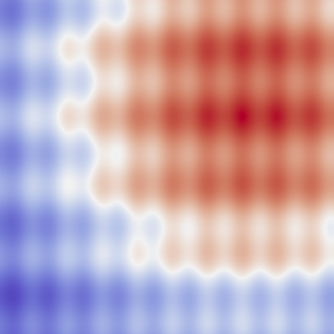
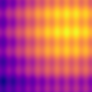
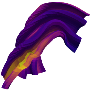
Fast
This color map was designed to be the default colormap in the ParaView scientific visualization tool. (Publication coming soon.) It is a diverging (double-ended) color map with a smooth transition in the middle to prevent artifacts at the midpoint. This colormap is designed to be used on 3D surfaces, so it avoids getting too dark at the ends (although it does get somewhat dark to extend discriminability).

Color Tables (byte): 8 16 32 64 128 256 512 1024
Color Tables (float): 8 16 32 64 128 256 512 1024
This color map is available in ParaView as the “Fast” preset.
Python code to generate these colors.
This color map was first featured in ParaView and is covered by its BSD license.
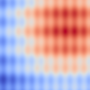
Smooth Cool Warm
This color map uses the techniques based on “Diverging Color Maps for Scientific Visualization” by Kenneth Moreland. It is a diverging (double-ended) color map with a smooth transition in the middle to prevent artifacts at the midpoint. There are several more color maps of a similar nature described here. Although not isoluminant, this color map avoids dark colors to allow shading cues throughout.
This colormap has been superseded by Fast, which has a similar color profile but better discriminability. I suggest using those colors instead.

Color Tables (byte): 8 16 32 64 128 256 512 1024
Color Tables (float): 8 16 32 64 128 256 512 1024
This color map is available in ParaView as the “Cool to Warm” preset.
Python code to generate these colors.
This color map was first featured in ParaView and is covered by its BSD license.
Bent Cool Warm
This is a similar color map to the previous except that the luminance is interpolated linearly with a sharp bend in the middle. This makes for less washed out colors in the middle, but also creates an artifact at the midpoint.
This colormap has been superseded by Fast, which has a similar color profile but better smoothness. I suggest using those colors instead.

Color Tables (byte): 8 16 32 64 128 256 512 1024
Color Tables (float): 8 16 32 64 128 256 512 1024
Download ParaView color map file.
Python code to generate these colors.
This color map is derivative of the cool to warm and might be covered under ParaView’s BSD license.
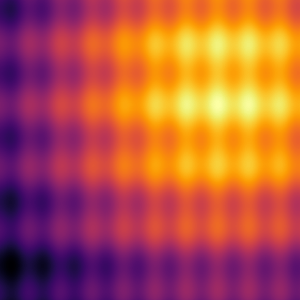
Viridis
Viridis is a perceptually uniform color map with monotonically increasing luminance and a pleasant smooth arc through blue, green, and yellow hues. Viridis is one of the matplotlib color maps, originally contributed by Eric Firing. Although none of the colors in viridis reach black, the bottom end of the scale does get dark, so map might need to be shortened for some 3D applications. Viridis shares similarities with (but is noticeably different from) MATLAB’s parula (which is not freely available). Pacific Northwest National Laboratory’s cividis adjusts viridis to compensate for color vision deficiencies. Although viridis is very perceptually smooth and monotonically increasing, it does not have as much discrimination as other color maps.

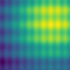
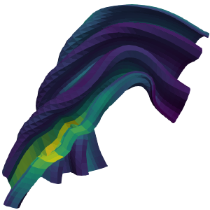
Color Tables (byte): 8 16 32 64 128 256 512 1024
Color Tables (float): 8 16 32 64 128 256 512 1024
This color map is available in ParaView as the “Viridis” preset.
Python code to generate these colors.
This color map was first featured in the matplotlib library and is covered by matplotlib’s BSD-compatible license.
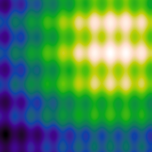
Plasma
Plasma is a perceptually uniform color map with monotonically increasing luminance and a pleasant smooth arc through blue, purple, and yellow hues. Plasma is one of the matplotlib color maps developed by Stéfan van der Walt and Nathaniel Smith. Although none of the colors in plasma reach black, the bottom end of the scale does get dark, so map might need to be shortened for some 3D applications. Inferno is a similar color map that extends the lower range all the way to black for 2D heat maps.

Color Tables (byte): 8 16 32 64 128 256 512 1024
Color Tables (float): 8 16 32 64 128 256 512 1024
This color map is available in ParaView as the “Plasma” preset.
Python code to generate these colors.
This color map was first featured in the matplotlib library and is covered by matplotlib’s BSD-compatible license.
2D Image Color Maps
When pseudocoloring is applied to the flat surface of the image, you do not have to contend with 3D shading. In this case, you are free to use the entire range of brightness from completely dark to full white. These color maps take advantage of that extra range.
Black Body
The black body color map is based on colors from black-body radiation. The colors are are not exact to those of black-body radiation but are designed to have a constant increase in brightness throughout.
The black body color map based on the colors of black body radiation. Although the colors are inspired by the wavelengths of light from black body radiation, the actual colors used are designed to be perceptually uniform. Colors of the desired brightness and hue are chosen, and then the colors are adjusted such that the luminance is perceptually linear (according to the CIELAB color space).

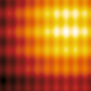
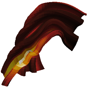
Color Tables (byte): 8 16 32 64 128 256 512 1024
Color Tables (float): 8 16 32 64 128 256 512 1024
Download ParaView color map file.
Python code to generate these colors.
Variations of this color map have been in literature at least as far back as 1983. To the best of my knowledge, no one claims intellectual property on these colors.
Inferno
Inferno is a perceptually uniform color map with monotonically increasing luminance. It is similar to black body but also adds some purple hues for a more appealing display. Inferno is one of the matplotlib color maps developed by Stéfan van der Walt and Nathaniel Smith. Plasma is a similar color map that removes the lower black colors to make it more appropriate for 3D surfaces.

Color Tables (byte): 8 16 32 64 128 256 512 1024
Color Tables (float): 8 16 32 64 128 256 512 1024
This color map is available in ParaView as the “Inferno” preset.
Python code to generate these colors.
This color map was first featured in the matplotlib library and is covered by matplotlib’s BSD-compatible license.
Kindlmann
The Kindlmann color map uses the colors first proposed in a paper by Kindlmann, Reinhard, and Creem. The map is basically the rainbow color map with the luminance adjusted such that it monotonically changes, making it much more perceptually viable.

Color Tables (byte): 8 16 32 64 128 256 512 1024
Color Tables (float): 8 16 32 64 128 256 512 1024
Download ParaView color map file.
Python code to generate these colors.
Since the original proposal, this color map has been used in numerous scientific works and software products. To the best of my knowledge, no one claims intellectual property on this color map.
Extended Kindlmann
The extended Kindlmann color map uses the colors from Kindlmann but also adds more hues by doing a more than 360 degree loop around the hues. This works because the endpoints have low saturation and very different brightness.

Color Tables (byte): 8 16 32 64 128 256 512 1024
Color Tables (float): 8 16 32 64 128 256 512 1024
Download ParaView color map file.
Python code to generate these colors.
This color map is a derivative of the Kindlmann color map. Any other similarities to other color maps are coincidental.
Other Resources
Color Brewer
The web-based Color Brewer tool, available at https://colorbrewer2.org/, is an excellent resource for choosing a collection of tools for a variety of uses.
CET Perceptually Uniform Color Maps
Peter Kovesi from the Centre for Exploration Targeting (CET) provides a collection of perceptually uniform color maps as well as example code used for their generation and analysis at https://colorcet.com/.
Sci Vis Color
Los Alamos National Laboratory and the Texas Advanced Computing Center have collaborated to provide some helpful tools and colormaps at https://sciviscolor.org/. Several colormaps presented in related work are available here.
Color Picking Tools
If you are just looking for an interpolation of colors in a perceptual space like Lab space but don’t want to go through the trouble of doing all the color conversions yourself, you can use David Johnstone’s gradient picker.
Maps for Event Horizon Telescope
The team creating tools for visualizing readings from the Event Horizon Telescope present a well thought out description of the color maps used in their tools.
Color Blindness Simulator
It is always good practice to check the images you make to ensure that the colors are resiliant to color blindness. Colblindor’s color blindness simulator provides a convenient way to check your images by simulating what your image will look like when viewed with different types of color blindness.
Publication
Why We Use Bad Color Maps and What You Can Do About It. Kenneth Moreland. In Proceedings of Human Vision and Electronic Imaging (HVEI), February 2016. doi:10.2352/ISSN.2470-1173.2016.16.HVEI-133.
Abstract We know the rainbow color map is terrible, and it is emphatically reviled by the visualization community, yet its use continues to persist. Why do we continue to use a this perceptual encoding with so many known flaws? Instead of focusing on why we should not use rainbow colors, this position statement explores the rational for why we do pick these colors despite their flaws. Often the decision is influenced by a lack of knowledge, but even experts that know better sometimes choose poorly. A larger issue is the expedience that we have inadvertently made the rainbow color map become. Knowing why the rainbow color map is used will help us move away from it. Education is good, but clearly not sufficient. We gain traction by making sensible color alternatives more convenient. It is not feasible to force a color map on users. Our goal is to supplant the rainbow color map as a common standard, and we will find that even those wedded to it will migrate away.
Full Paper
Why We Use Bad Color Maps and What You Can Do About It
Related Works
- Diverging Color Maps for Scientific Visualization.
Kenneth Moreland. In Proceedings of the 5th International Symposium on
Visual Computing, December 2009. DOI
10.1007/978-3-642-10520-3_9.
- Introduces the smooth diverging color maps.
- Face-Based Luminance Matching for Perceptual Colormap
Generation. Gordon Kindlmann, Erik Reinhard, and Sarah Creem.
In Proceedings of IEEE Visualization, pages 299–306, October 2002. DOI
10.1109/VISUAL.2002.1183788.
- Originally proposed what we call the Kindlmann color map.
- The Rainbow is Dead… Long Live the Rainbow! - Perceptual
Palettes, Part 5 - CIE LAB Linear L* Rainbow. Matteo Niccoli.
MyCarta (blog post), December 2012.
https://mycarta.wordpress.com/2012/12/06/the-rainbow-is-deadlong-live-the-rainbow-part-5-cie-lab-linear-l-rainbow/.
- Proposes adjusting using luminance in CIELAB space rather than human input to build the Kindlmann color map. I used the same technique to build the color map posted on this page.
- A Colour Scheme for the Display of Astronomical Intensity
Images. D. A. Green. Bulletin of the Astronomical Society of
India, 39:289–295, 2011. arXiv:1108.5083.
- A proposed color map technique that creates a color spiral of monotonic luminance. Similar concepts were used in the Extended Kindlmann color map presented here although the techniques used are different.